Second Savour
Refreshing A Sustainable E-Commerce Website
An e-commerce redesign that clarifies the brand’s sustainability story, improves product discovery, and makes local market information easier to access.

Timeline
4 days
(February 2026)
Role
Lead UX Design,
Web Design
Team
Victoria Xi,
Clara Xu,
Justine Abucay
Tools
Figma, FigJam
INTRODUCTION
The Client
Second Savour is a sustainability-driven food startup founded by a group of SFU students. Their mission is to reduce supply chain waste by transforming citrus peels, which are discarded by the juicing industry, into nutritious candied snacks in different flavours.

Design Mission
Strengthen and Refresh the Brand Identity
Refining the visual identity and connecting Second Savour's environmental mission with the values of its product
Create an engaging shopping journey
Redesigning a more cohesive e-commerce flow that guides customers clearly from product discovery to purchase
Make market information accessible
Designing a new interface for a dedicated schedule and location feature
IDENTIFYING THE PROBLEM THROUGH USER RESEARCH
Usability Testing
After meeting the Second Savour team and conducting 3 usability studies to observe users, I found some key issues with the original site:
Unclear e-commerce flow
Some participants struggled with navigation when looking for products. On the product page, they wished flavour, price, quantity and other information to be easier to identify.
Inconsistent visual identity
Mixed typography, inconsistent UI and uneven image treatments across the web pages made it feel less cohesive.
Lack of product storytelling
Participants wanted to learn more about how citrus peels were transformed into products and how their purchases contributed to reducing waste.
How can we communicate the sustainable value behind the citrus products while creating a clear shopping journey from discovery to purchase?
OPPORTUNITY
DESIGN APPROACH
My contribution to design and prototype on Figma
Key Change 1
Displaying prices and essential information directly on the product cards.

Previous design of product page
Following the refreshed visual identity, I redesigned the product cards to display prices and essential product information at a glance. This change addressed usability testing feedback, aiming to help shoppers compare options and decide which products to explore without opening each product page.
Redesigned product page
Key Change 2
Revising the ambiguous label to clarify its purpose and refined the product information to better explain the ingredients and upcycling process
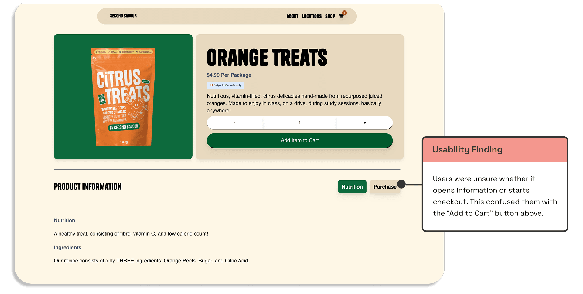
Previous design of product detail page
Redesigned product detail page
Key Change 3
Connecting Sustainability with Everyday Enjoyment
I added dedicated sections to the product page highlighting the sustainability value behind each package and recipes featuring the candies. The proposed design connects the brand’s environmental mission with practical ways to enjoy its products, helping shoppers understand their value and feel more confident about purchasing.
Redesigned product detail page
Key Change 4
Creating a Clearer and Consistent Checkout Experience
I redesigned both screens using the refreshed colour palette, typography, and rounded components to create a cohesive shopping experience.
Previous design of shopping cart and checkout page

Redesigned shopping cart and checkout page
Key Change 5
Designing a new interface for a dedicated schedule and location feature
New design interface for market information page
RESULT
Key details are easy to find, the overall experience helps users make informed decisions with confidence.
Here are some of feedback from the FLUI 2026 Judge Team:
Nina Tsou
Senior Product Designer @ lululemon
"The newly designed product detail page is phenomenal, with many thoughtful and impactful improvements. It presents information in a clear and intuitive way, making it much easier for users to understand the product at a glance."
Israa Qeroof
UX Designer Instructor @ CICCC
"The market schedule is clearly structured and easy to understand, with a smart separation between local stores and events. It solves a real user need without feeling overcomplicated. "
REFLECTION
Working within a short timeframe
The main challenge was the project’s short four-day timeline. Besides that, I also faced an unexpected challenge when a teammate left midway through the design phase and took on additional design responsibilities.
Therefore, I prioritized decisions according to the client interview and research instead of trying to redesign every possible page. The reusable Figma system also allowed me and my team to work more quickly and apply changes consistently. This approach helped complete a cohesive prototype while still leaving the system flexible for future expansion.


